Vintage Snoboy Snowman Crate Label ❄️ Mountain Bartletts Pear Advertising Art, Los Angeles Calif
Vintage Snoboy Snowman Crate Label ❄️ Mountain Bartletts Pear Advertising Art, Los Angeles Calif
❄️ Whatever Happened to the Little Snowman Who Sold Pears in the Middle of a California Summer?
There's something wonderfully backwards about a snowman standing guard over a crate of pears grown in the golden warmth of an American orchard. He's bundled up in red earmuffs and thick red mittens, grinning ear to ear, waving hello like he's been waiting on the loading dock all morning just for you. That little contradiction — winter cheer selling summer fruit — is exactly the kind of playful, unbothered optimism that mid-century advertising did better than anyone before or since. This is a genuine vintage Snoboy Mountain Bartletts crate label, printed for Snoboy, Inc. of Los Angeles, California, and it has survived in New Old Stock (NOS) condition — never used, never pasted to a crate, never sent anywhere near a produce truck. It simply sat, tucked away, waiting decades to be found.
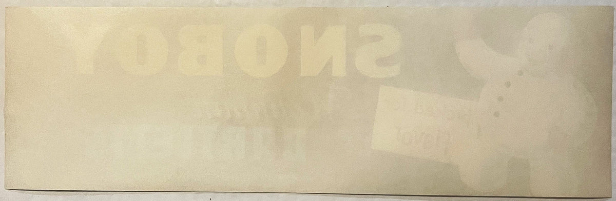
This label measures 13" x 4" (approximately 33 x 10 cm) — a long, narrow band, exactly the shape of the wooden pear crates it was designed to dress up. It's a lithographed, offset color print, built in a bold palette of deep navy blue, sunny yellow, cherry red, soft light blue, and crisp white. On the left, the Snoboy snowman waves one mitten high in the air while the other rests against his round white belly, four black buttons marching down his front, his round black eyes with their white catchlights locked right on you, printed eyebrows above them and a wide grin showing a single tooth. His face carries no blush at all — it is cream with grey stippled shading, and the only red on the figure is the earmuffs and the mittens. Beside him, a small yellow placard reading "picked for flavor" stands beside him, its left edge passing behind his mitten — he is not holding it, and his waving hand is empty — lettered in warm red script, a tiny heart dotting the "i" — the kind of small hand-drawn flourish a commercial artist added because it made the whole thing feel friendlier. To the right, the name SNOBOY stands in bold yellow block letters, with "Mountain" written beneath it in flowing light blue script and BARTLETTS below that in solid light blue capitals, followed by the small-type line: SNOBOY, INC., LOS ANGELES, CALIF., PRODUCE OF U.S.A. Style-wise — the rounded, cartoon-forward mascot, the bold sans-serif paired with a soft cursive script, and the flat offset color separation — places this firmly in the 1950s, the tail end of the golden era of crate label art before printed cardboard cartons took over the produce business for good.
🍐 The Snoboy Story — A Snowman Born in the Orchards of the Pacific Northwest
Long before this snowman ever waved hello from a Bartlett pear crate bound for a Los Angeles grocer, the Snoboy name was already making a name for itself hundreds of miles to the north. Company history traces Snoboy back to the Pacific Fruit and Produce Company, a distributor that got its start recognizing something growers already knew in their bones — that Washington-grown apples had a superiority worth shouting about. Rather than pack every apple that came off the truck, Pacific Fruit and Produce began selecting only the best of the crop to carry the Snoboy name, and it worked. Word of mouth did what advertising budgets couldn't: people from Tacoma clear out to the Yakima Valley began specifically asking for Snoboy fruit by name, trusting that the brand meant something before they ever bit into it.
That's the quiet secret behind a good crate label mascot — he wasn't just decoration, he was a promise. In an era before barcodes, before national grocery chains standardized everything down to the shelf tag, a grower's reputation rode entirely on the artwork stapled to the end of a wooden crate. A snowman with a friendly grin and a sign that said "picked for flavor" was doing real work: telling a produce buyer in a crowded wholesale market, at a glance, from twenty feet away, that this particular crate was worth a second look. As the Snoboy name grew from its Pacific Northwest apple roots, it stretched south and west, following the fruit — and by the postwar years it had planted itself on the West Coast produce scene under the banner of Snoboy, Inc., based in Los Angeles, marketing pears grown in California's mountain growing districts under the "Mountain" name seen right here on this very label. The snowman who started out promising the best of Washington's apple harvest had, by the 1950s, become the friendly face standing behind Bartlett pears as well — proof that a well-loved mascot, once trusted, gets put to work wherever the company's fruit travels.
🌇 Los Angeles — The City That Fed a Nation from a Warehouse District
By the mid-twentieth century, Los Angeles wasn't just orange groves and movie premieres — it was one of the great produce distribution hubs of the American West. Wholesale terminal markets sprang up downtown, warehouse rows filled with brokers, packers, and produce men who moved carloads of California-grown fruit east on refrigerated rail cars every single week. A company like Snoboy, Inc., headquartered right in the thick of that district, would have been one voice among dozens fighting for a produce buyer's attention on any given morning — which is exactly why the artwork mattered so much. Old-timers in the produce trade used to say you could tell a shipment's quality by the label alone before you'd even cracked the lid, and a company that could afford a full-color lithographed snowman mascot, was making a statement about the fruit inside just as much as the words on the sign he was holding.
Los Angeles in these years sat at the crossroads of California's inland mountain pear country and the rail lines running east — a natural home for a company marketing "Mountain" Bartletts. Collectors of California produce ephemera often point out that Los Angeles packing houses and produce brokers didn't just move California fruit; plenty of Pacific Northwest brands, Snoboy very much included, kept a Los Angeles office or affiliated operation specifically to reach the enormous Southern California market and the rail and shipping lanes that ran through it. It's a piece of West Coast commercial geography that this little label quietly preserves — a snowman born of Washington apple country, waving hello from a Los Angeles print shop, selling pears grown in the mountains.
☃️ Meet the Snowman — Advertising's Friendliest Off-Season Salesman
There's a reason snowman mascots turn up again and again in mid-century food and produce advertising, from ice cream to frozen vegetables to, here, a crate of sun-ripened pears. A snowman reads instantly as cold, clean, and refreshing — qualities a shopper associates with quality and freshness even when the product itself has nothing to do with winter at all. Collectors of vintage advertising art have long noted how these snow-themed mascots became a kind of shorthand across the whole food industry in this era, a visual promise of crispness and quality that needed no further explanation. The Snoboy snowman leans into that fully: red earmuffs, red mittens, a round soft body, and that unmistakable cartoon warmth in his expression — designed by an illustrator who clearly understood that a character people wanted to smile back at would sell more fruit than any block of statistics ever could.
Lore passed down among label collectors holds that fruit-crate mascots like this one were often deliberately kept simple and rounded — easy enough to reproduce cleanly at small size across dozens of print runs, friendly enough to appeal equally to a produce wholesaler and to the housewife who might spot the empty crate repurposed at a farm stand. Whether or not the Snoboy snowman was ever formally named beyond "Snoboy" himself, he clearly did his job — the brand endured for decades, carried forward on the goodwill this cheerful little character built one crate at a time.
📦 The Golden Age of the Crate Label — and Why It Ended
For roughly seventy years, from the late nineteenth century through the 1950s, the wooden shipping crate was itself a canvas. Growers, packers, and shipping cooperatives across California, Washington, and Oregon commissioned lithographers to print label after label — apples, pears, oranges, lettuce, all of it dressed up in bold, colorful artwork meant to catch a wholesale buyer's eye across a crowded rail yard or produce terminal. These labels were printed by the tens of thousands, stapled or pasted onto the end of a wooden crate, and put to work for exactly as long as it took the fruit inside to be sold. Once the crate was empty, the label's job was done.
That short working life is precisely why so few clean, unused examples survive today. Most crate labels met the same fate as the wooden crates they decorated — tossed, weathered, broken down, or simply lost to the churn of the produce business. The style itself was also on borrowed time: through the 1950s, pre-printed cardboard cartons began replacing the reusable wooden crate industry-wide, printed directly with the brand's artwork rather than requiring a separate paper label at all. That shift effectively closed the book on the crate label as an art form almost overnight, which is part of why labels from this exact era — right at that turning point — carry such weight with collectors today. This one, never applied, never handled in the field, is a genuine survivor of that closing chapter.
🎨 From Wholesale Warehouse to Wall Art
What began as disposable point-of-sale advertising has, in the decades since, been fully reclaimed as American folk art. Vintage crate labels like this one are now recognized as a legitimate branch of Americana — bold graphic design, hand-lettered typography, and mascot illustration that stands entirely on its own merit, no fruit crate required. Collectors and interior decorators alike have taken to the format precisely because it does double duty: it's real commercial history from a specific American company and city, and it's simply gorgeous, punchy, mid-century graphic art that holds its own on a wall next to any other piece of framed art. A snowman grinning out from a deep navy background with that bright yellow SNOBOY lettering is exactly the kind of thing that stops people mid-conversation in a kitchen or a home office — cheerful, a little funny, and instantly evocative of an era of American commerce that's long gone but endlessly charming to look back on.
🖼️ Display Ideas
- ❄️ Frame it as a stand-alone piece for a kitchen or breakfast nook, where the navy-and-yellow palette pops against light walls
- 🎄 Bring it out as playful seasonal décor each winter — a snowman that's technically about summer pears is a conversation starter every single year
- 🍐 Pair it with other vintage fruit-crate labels for a themed gallery wall celebrating California and Pacific Northwest produce history
- 🏢 Hang it in a home office, farm stand, or produce shop as a nod to the golden age of American advertising art
- 🎁 Give it as a framed gift for a collector of vintage advertising, Americana, or California and Los Angeles history
- 📚 Use it as a teaching piece — a great, visual entry point for talking about mid-century commercial lithography and produce branding
🎁 Who Collects These
Fruit crate label collecting has its own devoted following, and this piece sits right at a sweet spot within it — appealing equally to collectors of California and Pacific Northwest produce ephemera, folks who specifically hunt for mascot-driven advertising art, and general Americana and mid-century graphic design collectors who love bold vintage lettering and color. Los Angeles history buffs appreciate the direct tie to the city's once-thriving wholesale produce district, while pear and orchard-industry collectors value it as a documented piece of the Bartlett pear's long commercial story on the West Coast. It also draws in decorators looking for authentic, colorful mid-century art with a built-in story — the kind of piece that gets asked about the moment a guest notices it on the wall. And because genuinely clean, never-used examples from this era are hard to come by, collectors who focus specifically on New Old Stock ephemera tend to seek this exact condition out above all others.
❓ FAQ
What exactly is a fruit crate label?
It's a printed paper label produced for wooden shipping crates, used from the late 1800s through the 1950s by fruit and vegetable growers and distributors to brand and advertise their product to wholesale buyers. Each one was commissioned artwork, custom to the company and often to a specific fruit variety or grade.
What does "New Old Stock" mean here?
It means this label was printed for use, but never actually applied to a crate or put into service. It comes from surplus warehouse stock that sat unused rather than being consumed in the produce trade, which is part of why it survives today rather than having been discarded with the fruit crate it was meant for.
Is this a genuine, original vintage label?
Yes — this is an original printed Snoboy Mountain Bartletts label produced for Snoboy, Inc. of Los Angeles, California, not a modern reprint of a historic design.
What era does this label date to?
The design, mascot styling, typography, and lithographic printing all point to the 1950s, right at the twilight of the traditional crate label era before printed cardboard cartons took over the industry.
What size is the label?
It measures 13" x 4" (approximately 33 x 10 cm), a long narrow strip in the standard proportions used for fruit crate end labels of this period.
Was Snoboy an apple brand or a pear brand?
Both, at different points in its history. The Snoboy name got its start built on Washington-grown apples through the Pacific Fruit and Produce Company, and as the brand's reputation grew, it was carried forward onto other fruit, including the Bartlett pears marketed here under the "Mountain" name through the company's Los Angeles operation.
How should I display it?
Most collectors choose to frame it, letting the bold navy background and colorful lettering stand as a piece of graphic art on its own — no crate required.
❄️ Exactly What the Sheet Shows and Says
A few details worth having right, because they are the difference between describing this label and describing a snowman in general.
- He is not holding the sign. His right mitten waves high overhead and is empty; his left mitten rests low at his side. The yellow placard stands beside him, partly overlapped by his arm.
- Four black buttons, one at the collar and three below.
- No rosy cheeks. The face is cream with grey stippled shading — no pink, no red. The only red on the figure is the earmuffs (with white scalloped trim) and the mittens (with white rib-knit cuff stripes).
- Printed eyebrows, painted eyes with white catchlights, and a single visible tooth in the grin.
- A tiny outlined heart is used as the dot over the i in picked.
And the text, which is short. The whole of it: picked for flavor on the placard; SNOBOY; Mountain in script above BARTLETTS; and one small-type base line reading SNOBOY, INC., LOS ANGELES, CALIF., PRODUCE OF U.S.A.
The word BRAND is not printed anywhere on this sheet — Mountain is a script descriptor between SNOBOY and BARTLETTS, not a brand of its own — and neither is the word pear or pears. There is no net weight, no size, no grade and no growing-district place line, which is unusually sparse for a crate label. There is also no lithographer's imprint: the base line ends at PRODUCE OF U.S.A. and both bottom corners were cropped at 5x. No printer is claimed for this sheet.
Couldn't load pickup availability
Low stock: 9 left
View full details